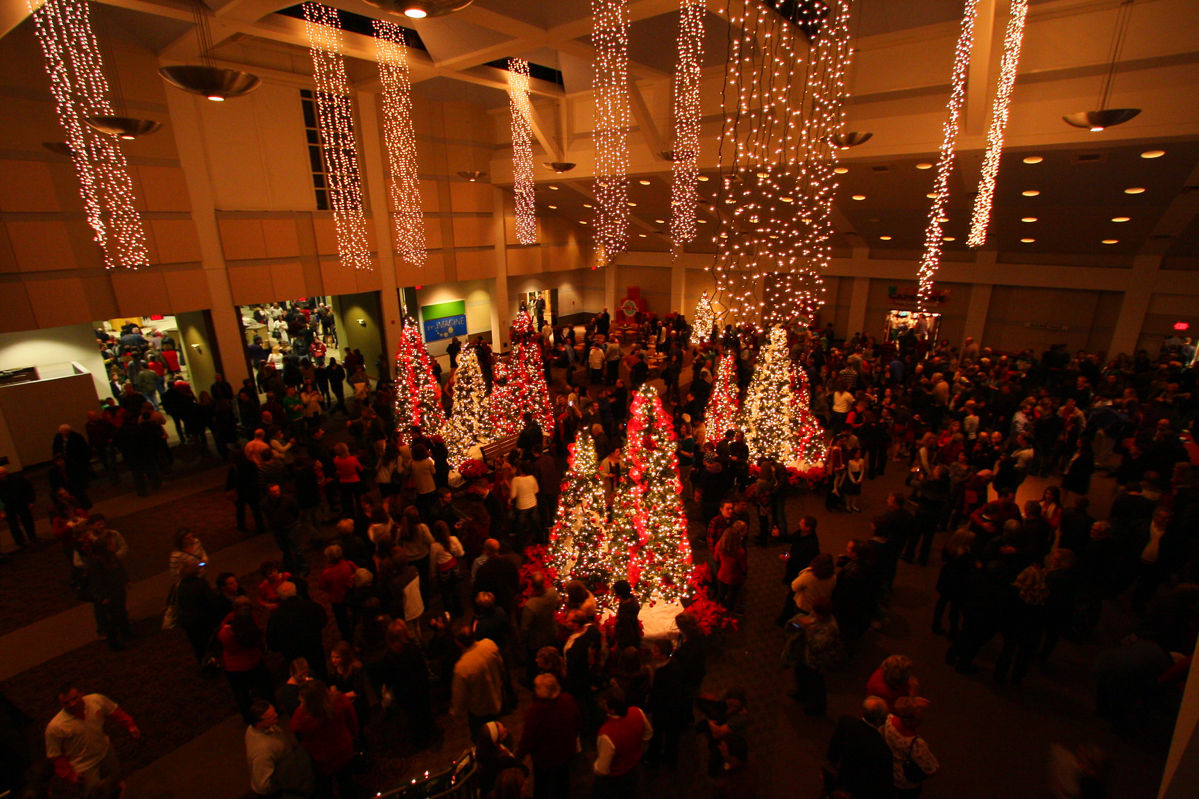
A super quick one for church websites… Stay “time neutral.” No, I’m not talking about making sure that the services/sermons don’t go too long [although that’s usually good advice, lol]. Rather, I’m referring to the look and feel of the visual imagery on the website itself. To be more specific, a better descriptor might be “season neutral.” Your website and online services together [along with social media] are your “front door,” the first impression that people have of you. It’s a disconnect if it seems that the website is rarely, if ever, updated in any way beyond the posting of weekly sermons.
I’ve found that it works best to take website photos during the spring and the fall. It’s weird if it’s July and the people on your site are wearing heavy winter coats with Christmas trees in the background – similarly, it’s strange to be in mid-February and see shorts and flip-flops…